Disney Plus has unveiled a major rebranding that includes a striking change in its logo color, shifting from its traditional Disney blue to a new, vibrant green shade named “Aurora.”
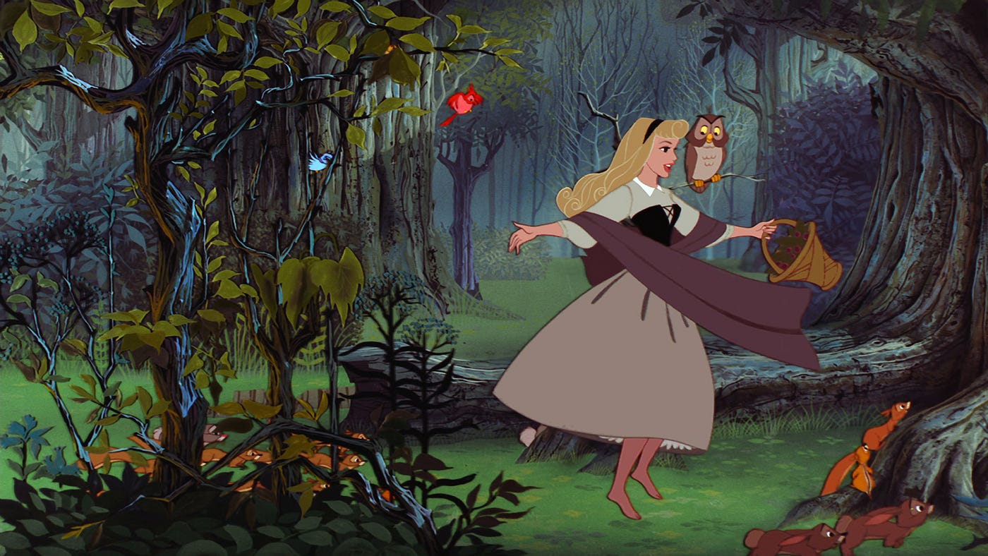
This bold move has sparked a mix of reactions among users and fans. The fresh hue aims to pay homage to the aurora borealis and the protagonist of “Sleeping Beauty,” while also signaling the integration of Hulu into the Disney Plus service.
The change, which has left some nostalgic and others intrigued by the differentiation from other streaming services, is part of a larger strategy to consolidate Disney’s streaming platforms and offerings under one roof, signaling a significant operational and strategic shift within the company.
Behind the New Green Logo
The new green color, indicative of a merger between the identities of Disney and Hulu, represents a departure from the classic Disney palette. This transition has been met with mixed reviews, with some viewers missing the nostalgic blue and others appreciating the uniqueness of the new design.

The rebranding includes a new mnemonic created by Ludwig Göransson, a renowned composer whose recent work includes an Oscar-winning Oppenheimer score. The new sound combines elements that might remind listeners of classic Disney melodies, Hulu’s signature crescendo, and possibly a hint of Pixar, blending the old with the new in a memorable auditory signature.
Harmonizing the New Visuals with Sound
In addition to the visual and audio updates, the integration of Hulu into Disney Plus involves a major restructuring of Disney’s streaming operations. This initiative is internally regarded as a relaunch of the Disney Plus platform, accompanied by extensive advertising campaigns to unveil Disney Plus’ new identity to the public. While the most noticeable change is the color of the logo, the app itself maintains its original color scheme.
There are also plans to further integrate Hulu and, in select regions, other services like Star, into the broader Disney Plus platform. This strategic shift is aimed at not only refreshing the brand’s appearance but also at streamlining and improving the overall streaming experience for users globally. Disney Plus seeks to distinguish itself in the competitive streaming market through these enhancements.
Related News:
Featured Image courtesy of Disney Junior/Disney Channel via Getty Images
